
On Minimalism
When I began studying graphic design, it was like an entirely new world was opened up to me. Designs that went mostly ignored throughout my life suddenly became impossible to miss; within a few months of starting at the College of DuPage, I began analyzing layout choices in magazines, posters, and TV commercials, critiquing type choices in logos, and assessing color palettes in illustrations. Graphic design can be mistakenly chalked down to a small field because designers typically work in the background, but there are few products we use on a daily basis that haven’t been touched by a designer.
Throughout my time as a designer, the design style I’ve seen rise to the forefront is minimalism. We’ve seen brands like Eddie Bauer and Johnson & Johnson abandon the human touch of handwritten logos for sans serif fonts. The Pringles mascot had its wig snatched in 2021, and Dunkin’ Donuts lost its surname in 2018. Modern brands aim to have simple identities and logos that only contain the bare necessities.
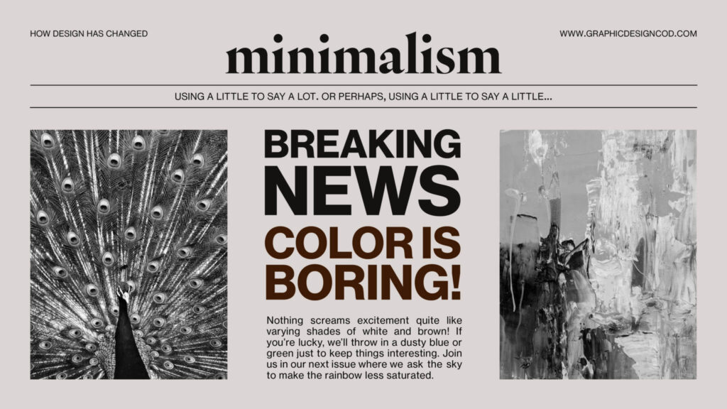
So, why minimalism? People’s attention spans are getting shorter and shorter due to short form social media videos. We have access to endless amounts of content in the palms of our hands. People are overwhelmed and overstimulated, and minimalism is a welcome reprieve from all that noise. Clean lines, minimal color palettes, and loads of negative space simultaneously calm the viewer and carry an air of sophistication. If luxury brands like Gucci and Chanel only need two letters for their logo, why would your brand need anything more?
Another reason why minimalism may be gaining so much popularity is an increased focus on user experience. Sans serif fonts are easier to read than handwritten ones, designs with sufficient contrast and minimal color are more accessible for those with colorblindness or low vision, and simple logos can be understood in a shorter time span than complicated ones.
Minimalism is such a significant movement that it can be seen in graphic design, architecture, interior design, and even in the way people live their lives. It’s the style of design I began exploring back when I started college in 2021 and began to break away from in 2024, starting a new exploration of louder, more out-of-my-comfort-zone design.
The Case of Burberry
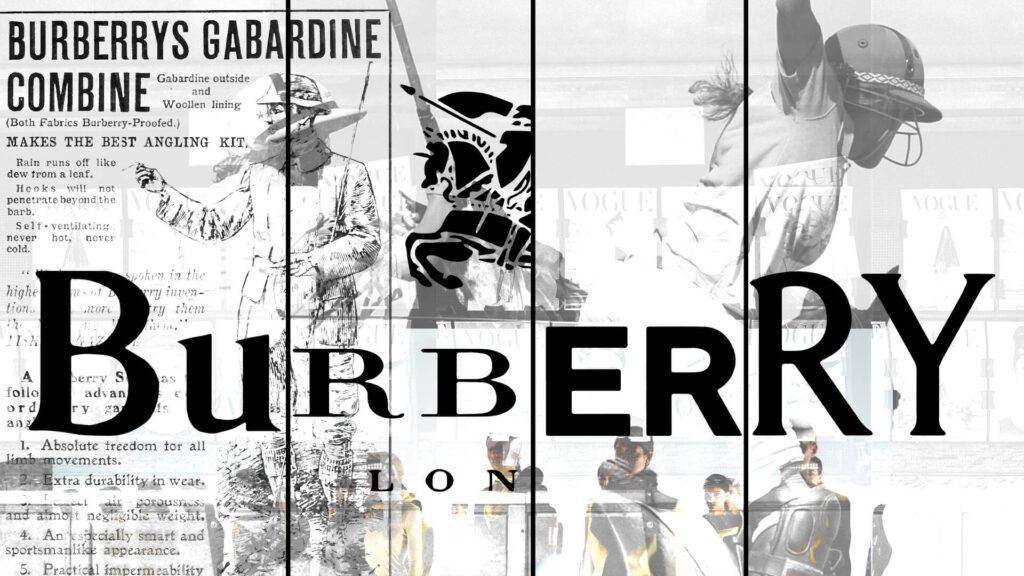
As a young child, my mother and I would walk through Macy’s makeup and perfume department, testing different scents and swatching lipsticks and eyeshadows on our hands. I grew up using hand-me-down makeup gifts that came with a purchase of a serum or moisturizer, subconsciously learning what luxury branding meant. To me, the logomark and serif typeface on my mother’s Burberry perfume was synonymous with her little treat and the iconic Burberry London plaid. The equestrian emblem symbolized what their magazine ads showed: rocky beaches and vast grass fields. Every Vogue and Harper’s Bazaar magazine my mother let me read visually stimulated the design part of my brain before I knew it existed. Brands cemented themselves in a visual identity not only through their photoshoots and models but also the logos themselves.
Luxury fashion went under a huge rebranding in 2018. Nearly every major fashion brand switched to bold sans serif. As Gen Z began aging into the new market, they changed the landscape of branding completely. Gen Z’s online global influence and interests were much more influential than traditional fashion. No longer were we influenced by the runway, but the runway was influenced by us. Luxury brands wanted to appeal to the younger audience and thus lost their identity and heritage.
In Burberry’s case, their brand has gone through many changes since it was founded in 1856. Originally, it was designer outdoor attire, representing heritage and sophistication. In the early 2000s, the plaid pattern became undeniably associated with “chav” and football culture. Eventually, it was reinstated to its luxury status again. However, in 2018, Riccardo Tisci was appointed the new Chief Creative Officer tasked to redesign the visual identity. Burberry shifted towards streetwear, and their brick-and-mortar spaces became more modern and minimalist. Perhaps the biggest change was their logo and monogram. Peter Saville designed the new sans-serif logo. This drew criticism from everywhere; fashion houses, industry professionals, and long-time customers were disappointed. It confused the industry. In 2023, Burberry returned to its original identity. Burberry’s SS 2024 collection was a combination of the classic, traditional Burberry image with a modern touch. Burberry’s decision to rebrand is an example of why modernizing and making everything minimalist will not always work. Yes, change is inevitable and crucial to a brand’s success, however, brands must not sacrifice their core identity and history.
Burberry is not the only one that underwent this transition. Brands like Balenciaga, Yves Saint Laurent, Berluti, Balmain, Rimova, and Diane Von Furstenberg also underwent this facelift. They are all bold and sans serif, you can’t tell the brand’s identities apart. But why make everything the same when Gen Z has one of the biggest influences on fashion? They are unapologetically bold and expressive. Luxury fashion’s new logos may be bold but are far from expressive.
I think it’s time to move away from bleak, cold, unexpressive, minimalist design. In an overstimulated world, we crave to eliminate distractions through minimalism. I, however, crave to flip through a magazine and be excited again.
Retro Design
In the day-to-day of my life, nostalgia has woven itself into various aspects of my life– from my choice of fashion, to the music that fills my playlist. But most importantly in the designs I see and make. Amidst the uncertainties of the past two years during the pandemic, a comforting revelation unfolded before my eyes as brands and designers embarked on a journey to rediscover some comfort by breathing new life into the timeless allure of retro designs.
The last couple of hard years have led many of us to seek refuge in the familiar, and it’s fascinating to witness how this sentiment materialized in the resurgence of retro aesthetics. While psychologists assert that nostalgia helps quite a bit in times of crisis, the unexpected prevalence of retro style remains a delightful resurgence to me.
Retro design is more than a mere aesthetic; it’s an artful fusion of past and modern elements that becomee contemporary masterpieces. Drawing inspiration from the decades of the 1950s, 1960s, 1970s, and 1980s, it zeroes in on the vivid memory of pop culture, typography, colors, and fashion. It encapsulates not only the essence of past eras but also captivates the hearts of most people nowadays.
The allure of retro design lies in its profound ability to stir powerful emotions, tethered to fond memories and collective experiences. Nostalgia serves as a unique conduit connecting people across generations, evoking cherished moments and simpler times. For graphic designers, this emotional resonance becomes a powerful tool, enabling them to craft designs that strike a deep chord with diverse audiences and that nowadays is being used quite a bit.
For a young designer it is amazing to see how these old trends that I remember being popular when I was a child come back again with more force and more to bring to the table than ever. The resurgence of retro design and many others is just another reminder of the fact that graphic design is always changing, be it in new and exciting directions or more in familiar and nostalgic ones.