
Illustration by jessica b
Graphic design is a form of visual communication, and when communicating, it’s important to keep your audience in mind. Everyone has different abilities and restrictions, so it’s our goal as designers to be as accessible as possible in order for our designs to function as intended. This article explores things to keep in mind when designing for accessibility.
General Design
Contrast
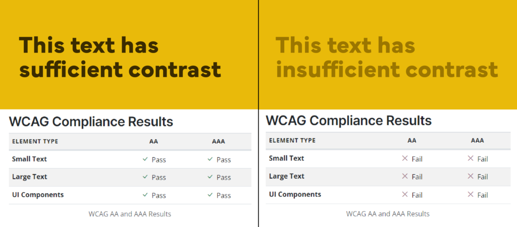
People with low vision or colorblindness can struggle to read text that doesn’t have sufficient contrast, so using a subtle change in color between text and its background may be inaccessible. If you’re worried that your text may not have enough contrast, you can use an accessibility validator like this one on Accessible Web which will give you a pass/fail for sufficient contrast.
Color
Use more than just color to communicate meaning. Since the meaning behind colors differs from culture to culture, and not everyone sees color in the same way, using another signal in addition to color to depict meaning is important. For example, if all street signs were the same shape, had no words, and were only set apart by color, someone who is colorblind may not be able to tell signs apart from each other. That’s why street signs have unique shapes and icons/words in addition to different colors.

Type
Type Size & Font
Sufficient type size and legible fonts are necessary when being accessible to anyone, regardless of their abilities. Print out projects that contain text before sending them to a client or printer for mass production to ensure the text is large enough to read. Stylized handwritten or cursive fonts should be reserved for headers and display text that is short and has a larger point size than body copy.

Columns
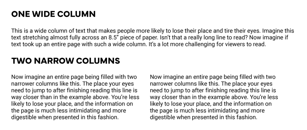
Consider breaking up wide columns of text into several smaller columns because scanning long lines of text can tire people’s eyes and make them more likely to lose their place.
Line Spacing
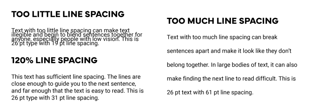
Line spacing should be close enough to guide the viewer’s eye to the next line, but not so close that the text has no room to breathe. Generally, having line spacing 120% of your type size is sufficient.
Images with Type
In the event you’re putting text atop an image, ensure there is sufficient contrast both in color and font weight. If attempting to put text on a busy image, consider putting a colored background (with full or reduced opacity) behind the text to increase legibility.

Web Design
Button Design
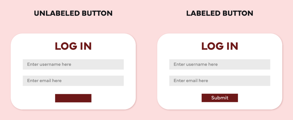
Make the function of buttons on your page obvious by labeling each according to its purpose and having it close to the content it pertains to.
Button Size
In order to make buttons easy to click on mobile layouts, ensure they have a minimum size of 44pt x 44pt. Keep buttons spaced far enough apart so users don’t click something unintentionally.
Type Size
The general rule of thumb for web design is that text should be no smaller than 16 pts. Preview all mobile layouts on your phone to ensure text size is sufficient and all type is legible.
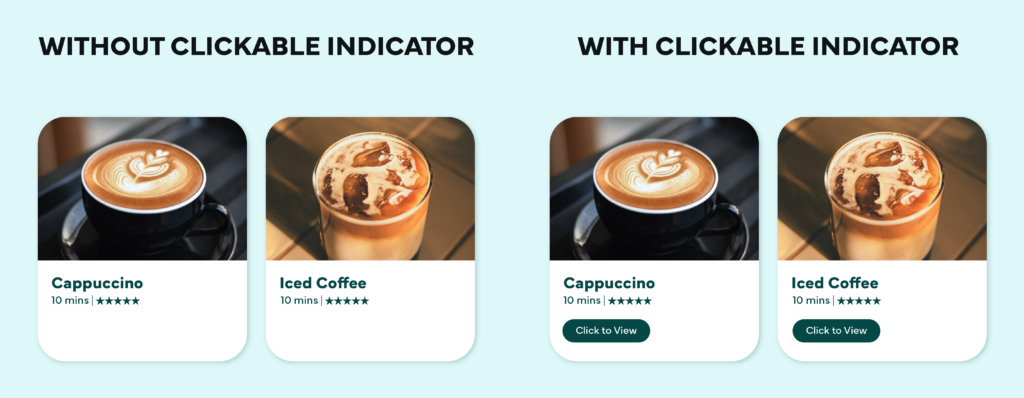
Indicators for Clickable Elements
With today’s minimalist approach to web design, it can be tempting to drop icons and words when designing a clickable card on a website. Remember that not everyone using your site has as much experience navigating the web as you do and may need indicators to know what can and cannot be clicked. Use text, buttons, or icons to indicate clickable items on a website.
Videos or Animations
Ensure that any animations or videos on your site don’t have flashing lights that may trigger an epileptic seizure. In the event you have a video that contains flashing lights, don’t set it to play automatically, instead give a flashing light warning and give the user the ability to play it voluntarily.
Alt Text
When coding a website, you have the ability to add alternative, or alt, text. This text will appear when images are unable to render or when someone with low vision is using a screen reader. Alt text should describe necessary images in the context needed to understand your site. Don’t use alt text for decorative images. The usage of alt text is also beneficial for Search Engine Optimization (SEO) which makes your site more likely to be recommended upon searching.
(Notice the alt text for a doggy daycare website below: instead of just saying there are two dogs in a field, they bring up the size of the field because it’s relevant information someone may need to know when bringing their dog to this business.)

Captions
Include captions on videos posted to websites and social media so they’re accessible to viewers that are hard of hearing.
There’s a lot that goes into making web design accessible. You can use sites like Checklist Design and Access Guide to view more web accessibility practices that were not mentioned in this article.